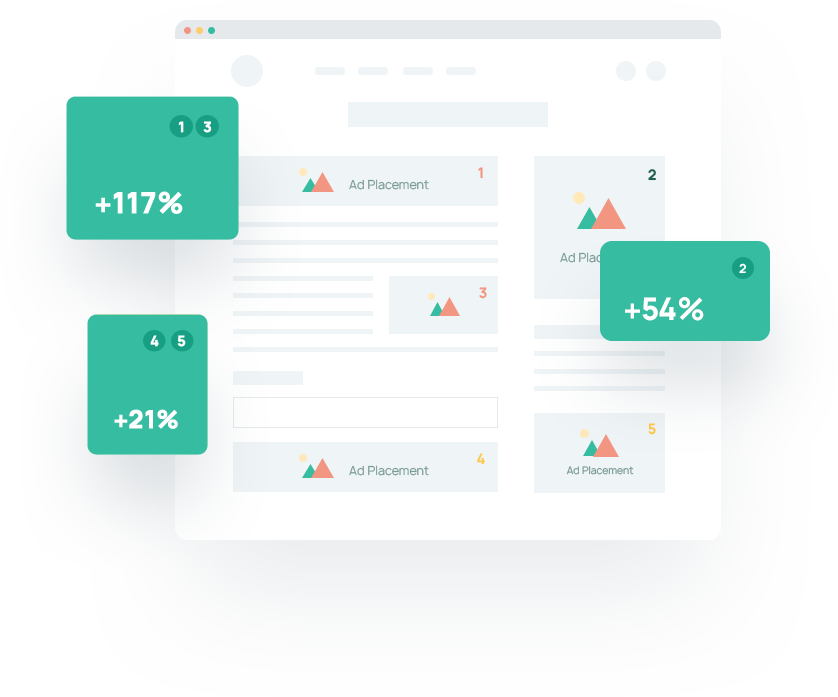
For publishers looking to make the most out of ad monetization, optimizing ad placement in their website is critical. If you can serve a target audience with ads, you’ll earn big. Ad placement refers to an ad unit or group of ad units used to specify where advertisers can place their ads. Creating high-value ad placements can be perplexing with so many options to choose from— size, type, and location of ads.
Each choice will directly affect whether an ad is in view, how users engage, and ad conversion rates—the more views and engagement, the higher the ad unit value. However, there are no guaranteed placements for catapulting revenue. Ultimately, creating successful ad placements is about personalization and optimizing the backend and user experience.
Ad Placement Best Practices
Balance user experience
It’s important to understand that publishers risk losing loyal audience members when ads begin to hinder user experience. So, revenue will also decrease from seeing a decline in website traffic. Instead, balancing ad placements with user experience can create high-performing ad units that are relevant and engaging.
Understanding user intent is the key to balance. When publishers recognize intent, they can make informed decisions about the types of media and placements that work best without getting in the way of users.
Placing ads above the fold
Above the fold ads are notorious for yielding high ad impressions— so long as it’s done well. It’s best to avoid overpopulating the area with advertisements for visual appearance and loading speed. Additionally, bloggers should avoid creating false bottoms. This occurs when an ad creates the illusion that there’s nothing further on the page. It encourages users to leave the page leading to high bounce rates and any ads below from being viewed.
Avoiding content layout shifts (CLS)
Content layout shifts are unexpected changes in the position, size, or structure of elements on your web page. For example, ads can lead to CLS during the page loading process. As your content begins to load, it becomes visible to the user, and then a slow-loading ad will become visible and shift what the user is seeing. If you’ve ever started reading something on a webpage or went to engage to then have everything move on you, you know how annoying this can be.
In addition to poor user experience, this is considered a big red flag in Google’s Core Web Vitals. As a result, SEO rankings can plummet as well as traffic. Avoiding CLS is a matter of ad placement and optimization. The best ad placement will be non-intrusive, minimal (number of ads), and optimized.
Number of ads
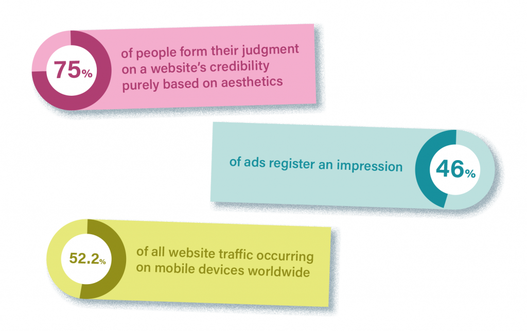
75% of people form their judgment on a website’s credibility purely based on aesthetics. Providing cluttered, obnoxiously sized, and over-placed ads will only result in a higher bounce rate, low impression ratings, and devalued content as a whole.
Ad Formats and When To Use Each
Publishers have a variety of ad types at their disposal. Ad types can describe an ad’s placements, properties, or contents (image, video, audio, etc.). In addition to helping you build a webpage to your desired look and feel, they can help you boost your metrics and earnings.
Banner ads
Banner ads are the traditional and most commonly used form of display ads. They exist on a web page’s header and include text or image content.
- Pros: doesn’t disrupt user intent, fast loading
- Cons: low engagement/banner blindness
Native ads
Native ads blend and look similar to their surrounding content. For example, a ‘sponsored’ post you find scrolling through social media is a form of native advertising. However, many consider it controversial because some users may feel tricked by the content.
- Pros: high viewability/CTR, integrates with content well
- Cons: controversial practice
Video ads
Video ads, as they suggest, contain video content. As a result, they can get tricky depending on the format publishers work with. Perhaps the most accessible place to start is with rich media video ads. They’re more engaging ad types that can incorporate video and audio, text, games, etc.— best of all, advertisers put in all the heavy lifting.
- Pros: high engagement/CTR, higher pay rates
- Cons: not supported by Google ads (so a third-party ad platform is necessary), can be tricky
Layout A/B Testing
It should come as no surprise that A/B testing is an essential part of optimizing layouts. Although there are many best practices to start with, none are tailored to you and your audience. To clarify, you can do everything an ad layout guide says and still see no increase in revenue or ever hit maximization—you deserve better!
A/B testing for ad placement and user experience can provide data-backed insight into what types of ads to implement and where to place them. Additionally, you’ll be able to assess the performance of any of the other tips and tricks we discuss. For example, does ad refresh work best here? Are sidebar ads my solution to CLS? A/B testing will give you all the answers.
Google AdSense publishers can use their heatmap tool to gauge where their audience lingers on pages. Aside from that, any other A/B testing will have to be done by publishers. It can be heavy lifting, but the boost in revenue is worth it.
The best results (and hands-off experience) can come from working with an ad management platform. Most use AI or adtech to automate and optimize layout testing and placement. If you’re using a header bidding provider (more on this later), using network A/B Testing on the same page can lead to programmatic bid confusion and problems—so be careful.
Design Around Revenue Model
There are various types of revenue models publishers can work with. Publishers can earn by view, engagement, action, or lead, depending on the ad network. Since ad revenue is dependent on meeting criteria, ad placement should work to meet the goal. The idea is that by prioritizing what metrics are essential, publishers can focus and maximize efforts.
For example, if you earn ad revenue on a CPC basis, your effort should improve click-through rates. So, incorporating more interactive ad types (rich media, video, etc.) would help boost revenue. On the other hand, if you were to earn with a CPM model, you’d work to strengthen the viewership of ads and placement quality. So you may consider working with sticky and sidebar ads.
How to Improve Ad Viewability

Viewability is a key factor in ad monetization. There are several tactics that when used correctly, can improve ad viewability.
Lazy loading
Implementing lazy loading on a site can create faster page loads and lead to a boost in impressions. Typically ads and other content are downloaded onto a site before a user begins navigating it. With lazy loading, placeholder content boxes are loaded, then replaced with the ads as the user scrolls a page or a certain amount of time passes.
Sticky ads
Sticky ads are placements anchored to a page that stay with users as they navigate it. They give users more time to view an ad and register an impression on the backend of things. Though they yield high impression rates, they can appear intrusive. Vertical ad placements perform better on desktops, whereas horizontal sticky ads perform best for mobile channels.
Ad refreshes
Auto-refresh can be beneficial to publishers with an audience that has above-average session times. While a user is still on the page, predefined triggers will request and render a new ad on an existing ad unit. This allows publishers to serve more impressions to the same user. As a result, you earn more from your content— no added effort on your end!
It’s important to note that any refreshing ad units not in view can negatively affect CPMs. AdSense does not allow for ad refreshing, so publishers are encouraged to use a header bidding provider for this feature. If you’re considering implementing ad refresh onto your website, be sure to brush up on all the important factors to know.
Optimize for Mobile Devices
54.4 percent of all website traffic worldwide occurs on mobile devices— that’s a lot of earning potential! Therefore, crafting mobile-friendly ads is necessary for any publisher hoping to tap into the revenue stream.
Unfortunately, ad space is no ‘one size fits all’ and must be tweaked across devices. Mobile users have a small display screen to engage with, making balancing user experience all the more vital. As a result, using a 300×250 below-the-fold ad does well on mobile sites and is a recommended place to start. However, testing different layouts to optimize impressions, engagement rates, and page loading speed will prove most resourceful.
Deploy Header Bidding
Header bidding is an advanced programmatic technique that brings multiple demand sources together to bid on ad space simultaneously. The increase in competition results in a surplus of bids for publishers’ ad units. So instead of just one pool of advertiser demand, you get access to dozens of large-scale markets.
Aside from yielding more significant revenue, header bidding providers are great resources for publishers seeking to optimize ad placement expertise. They can offer strategic ad placement based on a website’s insights and analytics. In addition, they typically support more ad types which gives you more variety to test.
Offer Multisize Ad Placements
By offering multisize ad placements, publishers can send requests for multiple ad sizes in one bid request. The result? An increase in the number of demand sources bidding for those ad units. Placement flexibility can also improve fill rates for publishers because of the increased competition.
Conclusion
Successfully optimizing ad placement in a site’s layout involves experimenting, testing, and collecting data. By exploring potential options—size, type, and location of ads, publishers can maximize their ad monetization yield. It’s important to note the best techniques and resources will produce high revenue without compromising user experience.
For publishers looking for a more hands-off approach, consider upgrading to an ad management platform. We provide all the fancy bells and whistles necessary to hit revenue maximization!

5 Comments
Comments are closed